In machine learning, the ability of a model to predict continuous or real values based on a training dataset is called Regression. With a small dataset and some great python libraries, we can solve such a problem with ease.
In this blog post, we will learn how to solve a supervised regression problem using the famous Boston housing price dataset. Other than location and square footage, a house value is determined by various other factors. Let’s analyze this problem in detail and come up with our own machine learning model to predict a housing price.
Objectives
After reading this post, we will understand
- How to solve a supervised regression problem using python?
- How to analyze and visualize a regression dataset using seaborn and pandas?
- How to apply data transforms to the dataset that has different units?
- How to handle missing values in a dataset?
- How to find out the best regression model for our problem?
- How to understand which features are important to predict the target?
Dependencies
I assume you have basic knowledge in installing Python and its packages using pip or Anaconda. If not, please check my post on setting up the environment to do machine learning for linux and windows. To follow this tutorial, you need to have the following installed in your machine.
- pandas - To work with solid data-structures, n-dimensional matrices and perform exploratory data analysis.
- matplotlib - To visualize data using 2D plots.
- seaborn - To make 2D plots look pretty and readable.
- scikit-learn - To create machine learning models easily and make predictions.
Boston Housing Prices Dataset
In this dataset, each row describes a boston town or suburb. There are 506 rows and 13 attributes (features) with a target column (price).
The problem that we are going to solve here is that given a set of features that describe a house in Boston, our machine learning model must predict the house price. To train our machine learning model with boston housing data, we will be using scikit-learn’s boston dataset.
We will use pandas and scikit-learn to load and explore the dataset. The dataset can easily be loaded from scikit-learn’s datasets module using load_boston function.
1
2
3
4
5
import pandas as pd
from sklearn.datasets import load_boston
pd.options.display.float_format = '{:,.2f}'.format

dataset = load_boston()
There are four keys in this dataset using which we can access more information about the dataset. data, target, feature_names and DESCR are the four keys which could be accessed using keys() on the dataset variable.
1
print("[INFO] keys : {}".format(dataset.keys()))
1
[INFO] keys : dict_keys(['data', 'target', 'feature_names', 'DESCR', 'filename'])
There are 13 features and 1 target that are accessed using data key and target key. We can easily access the shape of features and target using shape.
1
2
print("[INFO] features shape : {}".format(dataset.data.shape))
print("[INFO] target shape   : {}".format(dataset.target.shape))
1
2
[INFO] features shape : (506, 13)
[INFO] target shape   : (506,)
The 13 column names are accessed using feature_names on the dataset which returns the unique attribute names. We can use these column names when we convert this dataset to a pandas dataframe later.
1
2
print("[INFO] feature names")
print(dataset.feature_names)
1
2
[INFO] feature names
['CRIM' 'ZN' 'INDUS' 'CHAS' 'NOX' 'RM' 'AGE' 'DIS' 'RAD' 'TAX' 'PTRATIO' 'B' 'LSTAT']
To know the description of each column name in this dataset, you can use DESCR to display the description of this dataset in a nutshell.
1
2
print("[INFO] dataset summary")
print(dataset.DESCR)
1
2
3
4
5
6
7
8
9
10
11
12
13
14
15
16
17
18
19
20
21
22
23
24
25
26
27
28
29
30
31
32
33
34
35
36
37
38
39
40
41
42
43
44
45
46
47
48
49
50
51
52
53
54
[INFO] dataset summary
Boston House Prices dataset
===========================

Notes
------
Data Set Characteristics:

    :Number of Instances: 506

    :Number of Attributes: 13 numeric/categorical predictive

    :Median Value (attribute 14) is usually the target

    :Attribute Information (in order):
        - CRIM     per capita crime rate by town
        - ZN       proportion of residential land zoned for lots over 25,000 sq.ft.
        - INDUS    proportion of non-retail business acres per town
        - CHAS     Charles River dummy variable (= 1 if tract bounds river; 0 otherwise)
        - NOX      nitric oxides concentration (parts per 10 million)
        - RM       average number of rooms per dwelling
        - AGE      proportion of owner-occupied units built prior to 1940
        - DIS      weighted distances to five Boston employment centres
        - RAD      index of accessibility to radial highways
        - TAX      full-value property-tax rate per $10,000
        - PTRATIO  pupil-teacher ratio by town
        - B        1000(Bk - 0.63)^2 where Bk is the proportion of blacks by town
        - LSTAT    % lower status of the population
        - MEDV     Median value of owner-occupied homes in $1000's

    :Missing Attribute Values: None

    :Creator: Harrison, D. and Rubinfeld, D.L.

This is a copy of UCI ML housing dataset.
http://archive.ics.uci.edu/ml/datasets/Housing


This dataset was taken from the StatLib library which is maintained at Carnegie Mellon University.

The Boston house-price data of Harrison, D. and Rubinfeld, D.L. 'Hedonic
prices and the demand for clean air', J. Environ. Economics & Management,
vol.5, 81-102, 1978.   Used in Belsley, Kuh & Welsch, 'Regression diagnostics
...', Wiley, 1980.   N.B. Various transformations are used in the table on
pages 244-261 of the latter.

The Boston house-price data has been used in many machine learning papers that address regression
problems.

**References**

   - Belsley, Kuh & Welsch, 'Regression diagnostics: Identifying Influential Data and Sources of Collinearity', Wiley, 1980. 244-261.
   - Quinlan,R. (1993). Combining Instance-Based and Model-Based Learning. In Proceedings on the Tenth International Conference of Machine Learning, 236-243, University of Massachusetts, Amherst. Morgan Kaufmann.
   - many more! (see http://archive.ics.uci.edu/ml/datasets/Housing)
Analyze the dataset
We can easily convert the dataset into a pandas dataframe to perform exploratory data analysis. Simply pass in the dataset.data as an argument to pd.DataFrame(). We can view the first 5 rows in the dataset using head() function.
1
2
3
4
df = pd.DataFrame(dataset.data)
print("[INFO] df type : {}".format(type(df)))
print("[INFO] df shape: {}".format(df.shape))
print(df.head())
1
2
3
4
5
6
7
8
[INFO] df type : <class 'pandas.core.frame.DataFrame'>
[INFO] df shape: (506, 13)
    0     1    2    3    4    5     6    7    8      9     10     11   12
0 0.01 18.00 2.31 0.00 0.54 6.58 65.20 4.09 1.00 296.00 15.30 396.90 4.98
1 0.03  0.00 7.07 0.00 0.47 6.42 78.90 4.97 2.00 242.00 17.80 396.90 9.14
2 0.03  0.00 7.07 0.00 0.47 7.18 61.10 4.97 2.00 242.00 17.80 392.83 4.03
3 0.03  0.00 2.18 0.00 0.46 7.00 45.80 6.06 3.00 222.00 18.70 394.63 2.94
4 0.07  0.00 2.18 0.00 0.46 7.15 54.20 6.06 3.00 222.00 18.70 396.90 5.33
We can also specify the column names columns of the dataframe using feature_names instead of the indexes shown above.
1
2
df.columns = dataset.feature_names
print(df.head())
1
2
3
4
5
6
   CRIM    ZN  INDUS  CHAS  NOX   RM   AGE  DIS  RAD    TAX  PTRATIO      B  LSTAT
0  0.01 18.00   2.31  0.00 0.54 6.58 65.20 4.09 1.00 296.00    15.30 396.90   4.98
1  0.03  0.00   7.07  0.00 0.47 6.42 78.90 4.97 2.00 242.00    17.80 396.90   9.14
2  0.03  0.00   7.07  0.00 0.47 7.18 61.10 4.97 2.00 242.00    17.80 392.83   4.03
3  0.03  0.00   2.18  0.00 0.46 7.00 45.80 6.06 3.00 222.00    18.70 394.63   2.94
4  0.07  0.00   2.18  0.00 0.46 7.15 54.20 6.06 3.00 222.00    18.70 396.90   5.33
We can also insert the target column in our main dataframe simply using the below code snippet.
1
2
df["PRICE"] = dataset.target
print(df.head())
1
2
3
4
5
6
   CRIM    ZN  INDUS  CHAS  NOX   RM   AGE  DIS  RAD    TAX  PTRATIO      B  LSTAT  PRICE
0  0.01 18.00   2.31  0.00 0.54 6.58 65.20 4.09 1.00 296.00    15.30 396.90   4.98  24.00
1  0.03  0.00   7.07  0.00 0.47 6.42 78.90 4.97 2.00 242.00    17.80 396.90   9.14  21.60
2  0.03  0.00   7.07  0.00 0.47 7.18 61.10 4.97 2.00 242.00    17.80 392.83   4.03  34.70
3  0.03  0.00   2.18  0.00 0.46 7.00 45.80 6.06 3.00 222.00    18.70 394.63   2.94  33.40
4  0.07  0.00   2.18  0.00 0.46 7.15 54.20 6.06 3.00 222.00    18.70 396.90   5.33  36.20
We can check the datatype of each column using dtypes to make sure every column has numeric datatype. If a column has different datatype such as string or character, we need to map that column to a numeric datatype such as integer or float. For this dataset, luckily there is no such column.
1
print(df.dtypes)
1
2
3
4
5
6
7
8
9
10
11
12
13
14
15
CRIM       float64
ZN         float64
INDUS      float64
CHAS       float64
NOX        float64
RM         float64
AGE        float64
DIS        float64
RAD        float64
TAX        float64
PTRATIO    float64
B          float64
LSTAT      float64
PRICE      float64
dtype: object
Now, we will understand the statistical summary of the dataset using the describe() function. Using this function, we can understand the count, min, max, mean and standard deviation for each attribute (column) in the dataset. Each of these can also be displayed individually using df.count(), df.min(), df.max(), df.median() and df.quantile(q).
1
print(df.describe())
1
2
3
4
5
6
7
8
9
        CRIM     ZN  INDUS   CHAS    NOX     RM    AGE    DIS    RAD    TAX  PTRATIO      B  LSTAT  PRICE
count 506.00 506.00 506.00 506.00 506.00 506.00 506.00 506.00 506.00 506.00   506.00 506.00 506.00 506.00
mean    3.59  11.36  11.14   0.07   0.55   6.28  68.57   3.80   9.55 408.24    18.46 356.67  12.65  22.53
std     8.60  23.32   6.86   0.25   0.12   0.70  28.15   2.11   8.71 168.54     2.16  91.29   7.14   9.20
min     0.01   0.00   0.46   0.00   0.39   3.56   2.90   1.13   1.00 187.00    12.60   0.32   1.73   5.00
25%     0.08   0.00   5.19   0.00   0.45   5.89  45.02   2.10   4.00 279.00    17.40 375.38   6.95  17.02
50%     0.26   0.00   9.69   0.00   0.54   6.21  77.50   3.21   5.00 330.00    19.05 391.44  11.36  21.20
75%     3.65  12.50  18.10   0.00   0.62   6.62  94.07   5.19  24.00 666.00    20.20 396.23  16.96  25.00
max    88.98 100.00  27.74   1.00   0.87   8.78 100.00  12.13  24.00 711.00    22.00 396.90  37.97  50.00
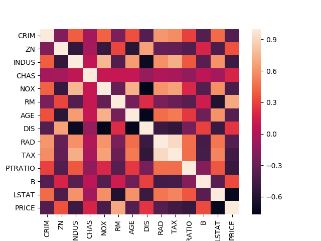
Correlation
Finding correlation between attributes is a highly useful way to check for patterns in the dataset. Pandas offers three different ways to find correlation between attributes (columns). The output of each of these correlation functions fall within the range [-1, 1].
- 1 - Positively correlated
- -1 - Negatively correlated.
- 0 - Not correlated.
To learn more about correlation, please read this wikipedia article. We will use df.corr() function to compute the correlation between attributes and sns.heatmap() function to visualize the correlation matrix.
1
2
3
4
5
6
7
8
9
10
11
12
13
14
15
16
17
18
19
20
21
# correlation between attributes
print("PEARSON CORRELATION")
print(df.corr(method="pearson"))
sns.heatmap(df.corr(method="pearson"))
plt.savefig("heatmap_pearson.png")
plt.clf()
plt.close()

print("SPEARMAN CORRELATION")
print(df.corr(method="spearman"))
sns.heatmap(df.corr(method="spearman"))
plt.savefig("heatmap_spearman.png")
plt.clf()
plt.close()

print("KENDALL CORRELATION")
print(df.corr(method="kendall"))
sns.heatmap(df.corr(method="kendall"))
plt.savefig("heatmap_kendall.png")
plt.clf()
plt.close()
1
2
3
4
5
6
7
8
9
10
11
12
13
14
15
16
17
18
19
20
21
22
23
24
25
26
27
28
29
30
31
32
33
34
35
36
37
38
39
40
41
42
43
44
45
46
47
48
49
50
PEARSON CORRELATION
         CRIM    ZN  INDUS  CHAS   NOX    RM   AGE   DIS   RAD   TAX  PTRATIO     B  LSTAT  PRICE
CRIM     1.00 -0.20   0.40 -0.06  0.42 -0.22  0.35 -0.38  0.62  0.58     0.29 -0.38   0.45  -0.39
ZN      -0.20  1.00  -0.53 -0.04 -0.52  0.31 -0.57  0.66 -0.31 -0.31    -0.39  0.18  -0.41   0.36
INDUS    0.40 -0.53   1.00  0.06  0.76 -0.39  0.64 -0.71  0.60  0.72     0.38 -0.36   0.60  -0.48
CHAS    -0.06 -0.04   0.06  1.00  0.09  0.09  0.09 -0.10 -0.01 -0.04    -0.12  0.05  -0.05   0.18
NOX      0.42 -0.52   0.76  0.09  1.00 -0.30  0.73 -0.77  0.61  0.67     0.19 -0.38   0.59  -0.43
RM      -0.22  0.31  -0.39  0.09 -0.30  1.00 -0.24  0.21 -0.21 -0.29    -0.36  0.13  -0.61   0.70
AGE      0.35 -0.57   0.64  0.09  0.73 -0.24  1.00 -0.75  0.46  0.51     0.26 -0.27   0.60  -0.38
DIS     -0.38  0.66  -0.71 -0.10 -0.77  0.21 -0.75  1.00 -0.49 -0.53    -0.23  0.29  -0.50   0.25
RAD      0.62 -0.31   0.60 -0.01  0.61 -0.21  0.46 -0.49  1.00  0.91     0.46 -0.44   0.49  -0.38
TAX      0.58 -0.31   0.72 -0.04  0.67 -0.29  0.51 -0.53  0.91  1.00     0.46 -0.44   0.54  -0.47
PTRATIO  0.29 -0.39   0.38 -0.12  0.19 -0.36  0.26 -0.23  0.46  0.46     1.00 -0.18   0.37  -0.51
B       -0.38  0.18  -0.36  0.05 -0.38  0.13 -0.27  0.29 -0.44 -0.44    -0.18  1.00  -0.37   0.33
LSTAT    0.45 -0.41   0.60 -0.05  0.59 -0.61  0.60 -0.50  0.49  0.54     0.37 -0.37   1.00  -0.74
PRICE   -0.39  0.36  -0.48  0.18 -0.43  0.70 -0.38  0.25 -0.38 -0.47    -0.51  0.33  -0.74   1.00

SPEARMAN CORRELATION
         CRIM    ZN  INDUS  CHAS   NOX    RM   AGE   DIS   RAD   TAX  PTRATIO     B  LSTAT  PRICE
CRIM     1.00 -0.57   0.74  0.04  0.82 -0.31  0.70 -0.74  0.73  0.73     0.46 -0.36   0.63  -0.56
ZN      -0.57  1.00  -0.64 -0.04 -0.63  0.36 -0.54  0.61 -0.28 -0.37    -0.45  0.16  -0.49   0.44
INDUS    0.74 -0.64   1.00  0.09  0.79 -0.42  0.68 -0.76  0.46  0.66     0.43 -0.29   0.64  -0.58
CHAS     0.04 -0.04   0.09  1.00  0.07  0.06  0.07 -0.08  0.02 -0.04    -0.14 -0.04  -0.05   0.14
NOX      0.82 -0.63   0.79  0.07  1.00 -0.31  0.80 -0.88  0.59  0.65     0.39 -0.30   0.64  -0.56
RM      -0.31  0.36  -0.42  0.06 -0.31  1.00 -0.28  0.26 -0.11 -0.27    -0.31  0.05  -0.64   0.63
AGE      0.70 -0.54   0.68  0.07  0.80 -0.28  1.00 -0.80  0.42  0.53     0.36 -0.23   0.66  -0.55
DIS     -0.74  0.61  -0.76 -0.08 -0.88  0.26 -0.80  1.00 -0.50 -0.57    -0.32  0.25  -0.56   0.45
RAD      0.73 -0.28   0.46  0.02  0.59 -0.11  0.42 -0.50  1.00  0.70     0.32 -0.28   0.39  -0.35
TAX      0.73 -0.37   0.66 -0.04  0.65 -0.27  0.53 -0.57  0.70  1.00     0.45 -0.33   0.53  -0.56
PTRATIO  0.46 -0.45   0.43 -0.14  0.39 -0.31  0.36 -0.32  0.32  0.45     1.00 -0.07   0.47  -0.56
B       -0.36  0.16  -0.29 -0.04 -0.30  0.05 -0.23  0.25 -0.28 -0.33    -0.07  1.00  -0.21   0.19
LSTAT    0.63 -0.49   0.64 -0.05  0.64 -0.64  0.66 -0.56  0.39  0.53     0.47 -0.21   1.00  -0.85
PRICE   -0.56  0.44  -0.58  0.14 -0.56  0.63 -0.55  0.45 -0.35 -0.56    -0.56  0.19  -0.85   1.00

KENDALL CORRELATION
         CRIM    ZN  INDUS  CHAS   NOX    RM   AGE   DIS   RAD   TAX  PTRATIO     B  LSTAT  PRICE
CRIM     1.00 -0.46   0.52  0.03  0.60 -0.21  0.50 -0.54  0.56  0.54     0.31 -0.26   0.45  -0.40
ZN      -0.46  1.00  -0.54 -0.04 -0.51  0.28 -0.43  0.48 -0.23 -0.29    -0.36  0.13  -0.39   0.34
INDUS    0.52 -0.54   1.00  0.08  0.61 -0.29  0.49 -0.57  0.35  0.48     0.34 -0.19   0.47  -0.42
CHAS     0.03 -0.04   0.08  1.00  0.06  0.05  0.06 -0.07  0.02 -0.04    -0.12 -0.03  -0.04   0.12
NOX      0.60 -0.51   0.61  0.06  1.00 -0.22  0.59 -0.68  0.43  0.45     0.28 -0.20   0.45  -0.39
RM      -0.21  0.28  -0.29  0.05 -0.22  1.00 -0.19  0.18 -0.08 -0.19    -0.22  0.03  -0.47   0.48
AGE      0.50 -0.43   0.49  0.06  0.59 -0.19  1.00 -0.61  0.31  0.36     0.25 -0.15   0.49  -0.39
DIS     -0.54  0.48  -0.57 -0.07 -0.68  0.18 -0.61  1.00 -0.36 -0.38    -0.22  0.17  -0.41   0.31
RAD      0.56 -0.23   0.35  0.02  0.43 -0.08  0.31 -0.36  1.00  0.56     0.25 -0.21   0.29  -0.25
TAX      0.54 -0.29   0.48 -0.04  0.45 -0.19  0.36 -0.38  0.56  1.00     0.29 -0.24   0.38  -0.41
PTRATIO  0.31 -0.36   0.34 -0.12  0.28 -0.22  0.25 -0.22  0.25  0.29     1.00 -0.04   0.33  -0.40
B       -0.26  0.13  -0.19 -0.03 -0.20  0.03 -0.15  0.17 -0.21 -0.24    -0.04  1.00  -0.15   0.13
LSTAT    0.45 -0.39   0.47 -0.04  0.45 -0.47  0.49 -0.41  0.29  0.38     0.33 -0.15   1.00  -0.67
PRICE   -0.40  0.34  -0.42  0.12 -0.39  0.48 -0.39  0.31 -0.25 -0.41    -0.40  0.13  -0.67   1.00
Missing Values
Sometimes, in a dataset we will have missing values such as NaN or empty string in a cell. We need to take care of these missing values so that our machine learning model doesn’t break. To handle missing values, there are three approaches followed.
- Replace the missing value with a large negative number (e.g. -999).
- Replace the missing value with mean of the column.
- Replace the missing value with median of the column.
To find if a column in our dataset has missing values, you can use pd.isnull(df).any() which returns a boolean for each column in the dataset that tells if the column contains any missing value. In this dataset, there are no missing values!
1
print(pd.isnull(df).any())
1
2
3
4
5
6
7
8
9
10
11
12
13
14
15
CRIM       False
ZN         False
INDUS      False
CHAS       False
NOX        False
RM         False
AGE        False
DIS        False
RAD        False
TAX        False
PTRATIO    False
B          False
LSTAT      False
PRICE      False
dtype: bool
Once a dataset is available to us, it is always good to generate a brief report that gives lots of statistical information about the dataset so that you get to know the structure or nature of the dataset. You can use the below code snippet to generate a report like this.
1
2
3
4
5
6
7
8
9
10
11
12
13
14
15
16
17
18
19
20
21
22
23
24
25
26
27
28
29
30
31
32
33
34
35
36
37
38
39
40
file_report = "boston_housing.txt"
with open(file_report, "w") as f:
	f.write("Features shape : {}".format(df.drop("PRICE", axis=1).shape))
	f.write("\n")

	f.write("Target shape   : {}".format(df["PRICE"].shape))
	f.write("\n")

	f.write("\nColumn names")
	f.write("\n")
	f.write(str(df.columns))
	f.write("\n")

	f.write("\nStatistical summary")
	f.write("\n")
	f.write(str(df.describe()))
	f.write("\n")

	f.write("\nDatatypes")
	f.write("\n")
	f.write(str(df.dtypes))
	f.write("\n")

	f.write("\nPEARSON correlation")
	f.write("\n")
	f.write(str(df.corr(method="pearson")))
	f.write("\n")

	f.write("\nSPEARMAN correlation")
	f.write("\n")
	f.write(str(df.corr(method="spearman")))
	f.write("\n")

	f.write("\nKENDALL correlation")
	f.write("\n")
	f.write(str(df.corr(method="kendall")))

  f.write("\nMissing Values")
  f.write("\n")
  f.write(str(pd.isnull(df).any()))
Visualize the dataset
We will use two types of visualization strategy namely univariate plots and bivariate plots. As the name suggests, univariate plot is used to visualize a single column or an attribute whereas bivariate plot is used to visualize two columns or two attributes.
Box plot
A box-whisker plot is a univariate plot used to visualize a data distribution.
- The ends of whiskers are the maximum and minimum range of data distribution.
- The central line in the box is the median of the entire data distribution.
- The right and left edges in the box are the medians of data distribution to the right and left from the central median, respectively.
Understand more about box plots here.
1
2
3
4
5
6
7
8
9
10
11
12
13
14
15
16
17
18
19
20
# visualize the dataset
import matplotlib.pyplot as plt
import seaborn as sns
import random
import os

sns.set(color_codes=True)
colors = ["y", "b", "g", "r"]

cols = list(df.columns.values)

if not os.path.exists("plots/univariate/box"):
    os.makedirs("plots/univariate/box")

# draw a boxplot with vertical orientation
for i, col in enumerate(cols):
	sns.boxplot(df[col], color=random.choice(colors), orient="v")
	plt.savefig("plots/univariate/box/box_" + str(i) + ".png")
	plt.clf()
	plt.close()
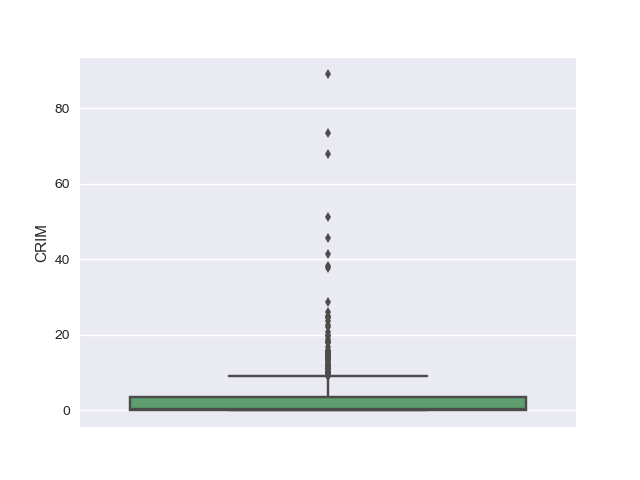
Using the box plots, we could see that there are outliers in the dataset for attributes such as CRIM, ZN, CHAS, DIS, PTRATIO, LSTAT, B and PRICE.
Density plot
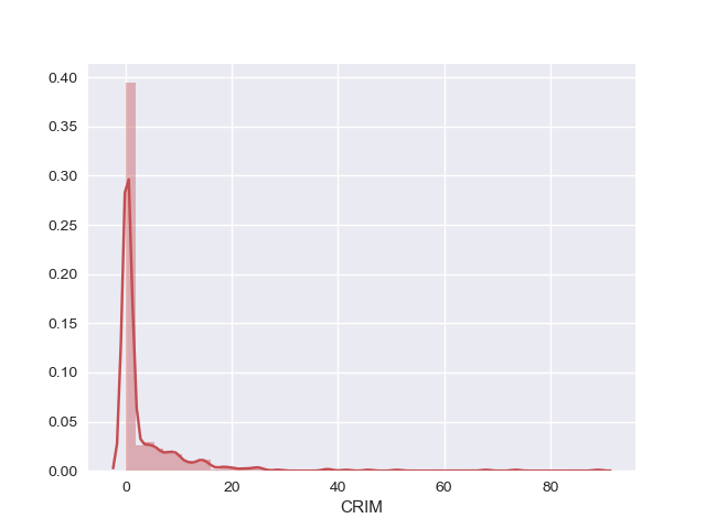
Density plot is another univariate plot that draws a histogram of the data distribution and fits a Kernel Density Estimate (KDE).
A histogram is a graphical representation of a frequency distribution where data points are organized as bins, plotted with values along the x-axis and the count of data points in each bin along the y-axis.
A Kernel Density Plot shows a smooth representation of the data points.
1
2
3
4
5
6
7
8
9
if not os.path.exists("plots/univariate/density"):
    os.makedirs("plots/univariate/density")

# draw a histogram and fit a kernel density estimate (KDE)
for i, col in enumerate(cols):
	sns.distplot(df[col], color=random.choice(colors))
	plt.savefig("plots/univariate/density/density_" + str(i) + ".png")
	plt.clf()
	plt.close()
1
2
3
4
5
6
7
8
9
10
11
12
if not os.path.exists("plots/multivariate"):
    os.makedirs("plots/multivariate")

# bivariate plot between target and reason of absence
for i, col in enumerate(cols):
	if (i == len(cols) - 1):
		pass
	else:
		sns.jointplot(x=col, y="PRICE", data=df);
		plt.savefig("plots/multivariate/target_vs_" + str(i) + ".png")
		plt.clf()
		plt.close()
Using the density plots, we can see that CRIM, AGE, B and ZN have exponential distribution. NOX, RM and LSTAT is probably having a skewed gaussian distribution. Also, we could notice that RAD and TAX have bimodal distribution.
Scatter plot
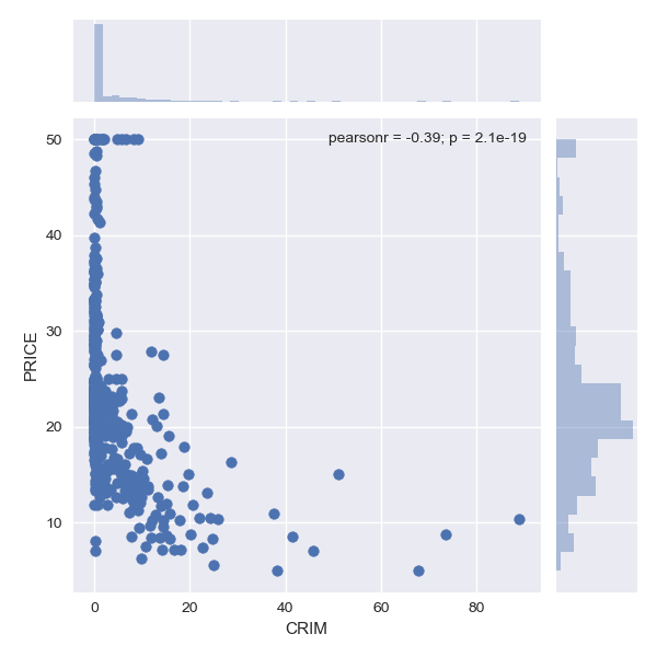
Scatter plot is used to understand relationship between two different attributes in the dataset. Below we have compared PRICE (target) vs each of the attribute in the dataset.
Pairplot
For each pair of features (columns) in the dataset, we can visualize the scatter plot for each pair along with the feature’s histogram along the diagonal in a single image using sns.pairplot() function.
1
2
3
4
5
# pairplot
sns.pairplot(df)
plt.savefig("plots/pairplot.png")
plt.clf()
plt.close()
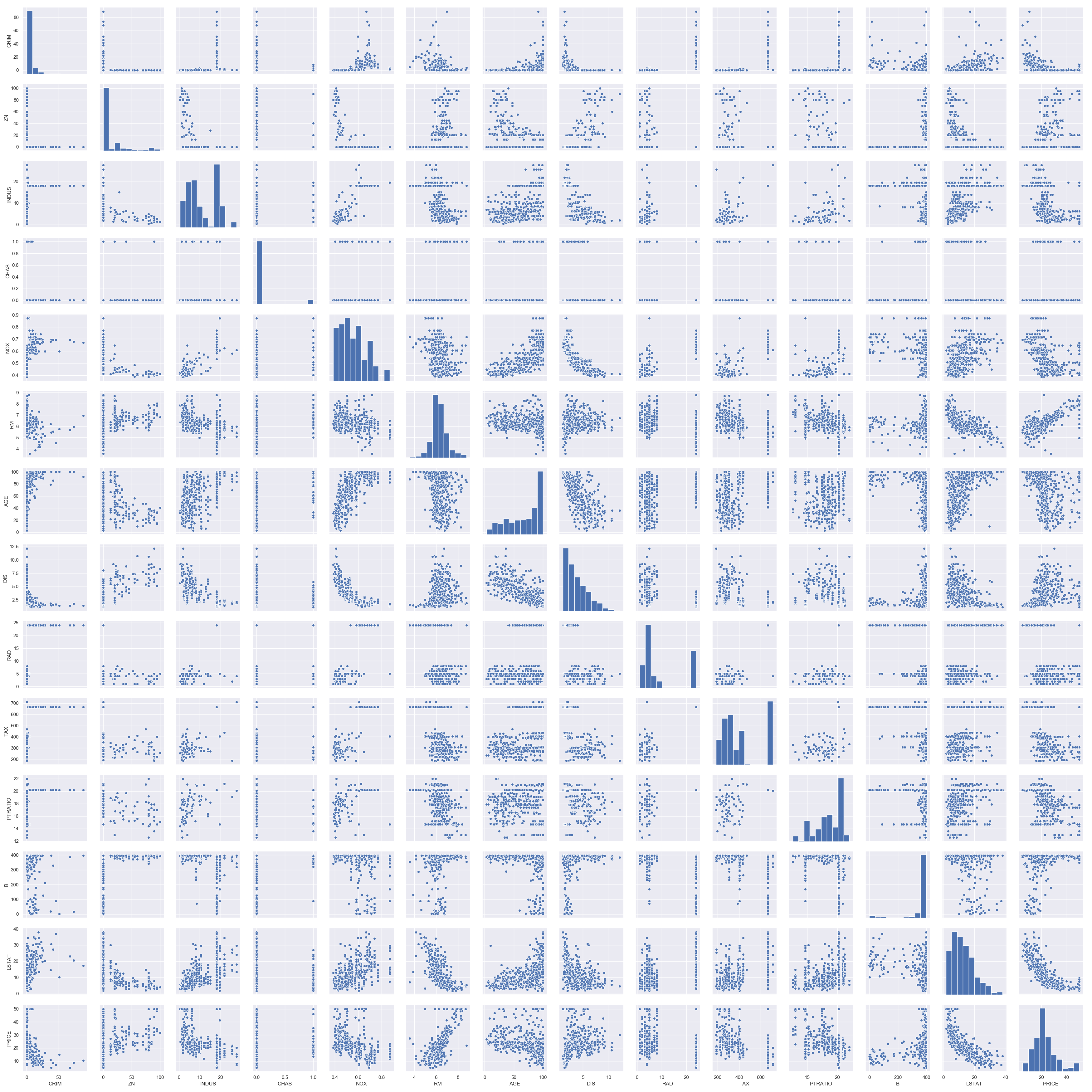
We see a lot of structure in this dataset with outliers and different data distributions. Two key take aways from these visualizations are
- Data is not standardized (meaning there are different data distributions).
- Data is not normalized (meaning there are differing scales of data).
Training regression models
By looking at the dataset, we simply can’t suggest the best regression model for this problem. So, we will try out different regression models available in scikit-learn with a 10-fold cross validation method.
It means we split the training data into train and test data using a test_size parameter for 10-folds. Each fold will have different samples that are not present in other folds. By this way, we can throughly train our model on different samples in the dataset.
Before doing anything, we will split our boston housing prices dataframe df into features X and target Y.
1
2
3
4
X = df.drop("PRICE", axis=1)
Y = df["PRICE"]
print(X.shape)
print(Y.shape)
1
2
(506, 13)
(506,)
As we see different data distributions, we will standardize the dataset using StandardScaler function in scikit-learn. This is a useful technique where the attributes are transformed to a standard gaussian distribution with a mean of 0 and a standard deviation of 1.
1
2
3
from sklearn.preprocessing import StandardScaler, MinMaxScaler
scaler = MinMaxScaler().fit(X)
scaled_X = scaler.transform(X)
Now, we will split the data into train and test set. We can easily do this using scikit-learn’s train_test_split() function using a test_size parameter.
1
2
3
4
5
6
7
8
9
10
11
from sklearn.model_selection import train_test_split

seed      = 9
test_size = 0.20

X_train, X_test, Y_train, Y_test = train_test_split(scaled_X, Y, test_size = test_size, random_state = seed)

print(X_train.shape)
print(X_test.shape)
print(Y_train.shape)
print(Y_test.shape)
1
2
3
4
(404, 13)
(102, 13)
(404,)
(102,)
Let’s dive into regression. We will use different regression models offered by scikit-learn to produce a baseline accuracy for this problem. We will use the MSE (Mean Squared Error) as the performance metric for the regression models.
1
2
3
4
5
6
7
8
9
10
11
12
13
14
15
16
17
18
19
20
21
22
23
24
25
26
27
28
29
30
31
32
33
34
35
36
37
38
39
40
41
42
43
44
45
46
47
48
49
50
51
52
53
54
from sklearn.model_selection import KFold
from sklearn.model_selection import cross_val_score
from sklearn.linear_model import LinearRegression
from sklearn.linear_model import Lasso
from sklearn.linear_model import ElasticNet
from sklearn.tree import DecisionTreeRegressor
from sklearn.neighbors import KNeighborsRegressor
from sklearn.svm import SVR
from sklearn.ensemble import AdaBoostRegressor
from sklearn.ensemble import GradientBoostingRegressor
from sklearn.ensemble import RandomForestRegressor
from sklearn.ensemble import ExtraTreesRegressor
from sklearn.metrics import mean_squared_error

# user variables to tune
folds   = 10
metric  = "neg_mean_squared_error"

# hold different regression models in a single dictionary
models = {}
models["Linear"]        = LinearRegression()
models["Lasso"]         = Lasso()
models["ElasticNet"]    = ElasticNet()
models["KNN"]           = KNeighborsRegressor()
models["DecisionTree"]  = DecisionTreeRegressor()
models["SVR"]           = SVR()
models["AdaBoost"]      = AdaBoostRegressor()
models["GradientBoost"] = GradientBoostingRegressor()
models["RandomForest"]  = RandomForestRegressor()
models["ExtraTrees"]    = ExtraTreesRegressor()

# 10-fold cross validation for each model
model_results = []
model_names   = []
for model_name in models:
	model   = models[model_name]
	k_fold  = KFold(n_splits=folds, random_state=seed)
	results = cross_val_score(model, X_train, Y_train, cv=k_fold, scoring=metric)

	model_results.append(results)
	model_names.append(model_name)
	print("{}: {}, {}".format(model_name, round(results.mean(), 3), round(results.std(), 3)))

# box-whisker plot to compare regression models
figure = plt.figure()
figure.suptitle('Regression models comparison')
axis = figure.add_subplot(111)
plt.boxplot(model_results)
axis.set_xticklabels(model_names, rotation = 45, ha="right")
axis.set_ylabel("Mean Squared Error (MSE)")
plt.margins(0.05, 0.1)
plt.savefig("model_mse_scores.png")
plt.clf()
plt.close()
1
2
3
4
5
6
7
8
9
10
Linear        : -23.794, 12.358
Lasso         : -63.82,  20.646
ElasticNet    : -69.362, 21.371
KNN           : -26.366, 16.169
DecisionTree  : -26.64,  13.894
SVR           : -53.247, 22.157
AdaBoost      : -13.846,  5.635
GradientBoost : -10.247,  5.328
RandomForest  : -12.418,  6.976
ExtraTrees    : -11.568,  7.065
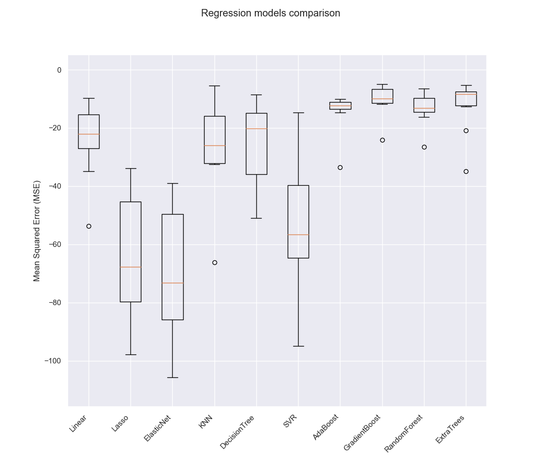
Choosing the best model
Based on the above comparison, we can see that Gradient Boosting Regression model outperforms all the other regression models. So, we will choose it as the best regression model for this problem.
1
2
3
4
5
6
7
# create and fit the best regression model
best_model = GradientBoostingRegressor(random_state=seed)
best_model.fit(X_train, Y_train)

# make predictions using the model
predictions = best_model.predict(X_test)
print("[INFO] MSE : {}".format(round(mean_squared_error(Y_test, predictions), 3)))
1
[INFO] MSE : 9.961
Finally, we can see that Gradient Boosting Regression model achieved a mean squared error of 9.961 which means our model is able to predict correct values on test data with MSE of 9.961. We can visualize the predictions made by our best model and the original targets Y_test using the below code.
1
2
3
4
5
6
7
8
9
10
11
# plot between predictions and Y_test
x_axis = np.array(range(0, predictions.shape[0]))
plt.plot(x_axis, predictions, linestyle="--", marker="o", alpha=0.7, color='r', label="predictions")
plt.plot(x_axis, Y_test, linestyle="--", marker="o", alpha=0.7, color='g', label="Y_test")
plt.xlabel('Row number')
plt.ylabel('PRICE')
plt.title('Predictions vs Y_test')
plt.legend(loc='lower right')
plt.savefig("predictions_vs_ytest.png")
plt.clf()
plt.close()
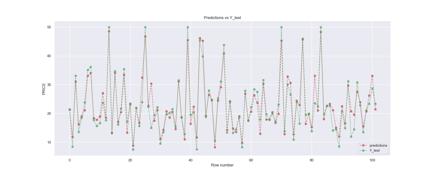
We could still tune different regression models used in this example using scikit-learn’s GridSearchCV() function. By tuning, we mean trying out different hyper-parameters for each model. You can check this post to perform hyperparameter tuning.
Feature Importance
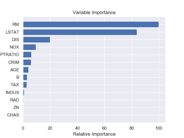
Once we have a trained model, we can understand feature importance (or variable importance) of the dataset which tells us how important each feature is, to predict the target. Figure 7 shows relative importance of different feature in the dataset made by our best model Gradient Boosting Regressor (GBR).
1
2
3
4
5
6
7
8
9
10
11
12
13
14
# plot model's feature importance
feature_importance = best_model.feature_importances_
feature_importance = 100.0 * (feature_importance / feature_importance.max())

sorted_idx = np.argsort(feature_importance)
pos        = np.arange(sorted_idx.shape[0]) + .5

plt.barh(pos, feature_importance[sorted_idx], align='center')
plt.yticks(pos, dataset.feature_names[sorted_idx])
plt.xlabel('Relative Importance')
plt.title('Variable Importance')
plt.savefig("feature_importance.png")
plt.clf()
plt.close()
In case if you found something useful to add to this article or you found a bug in the code or would like to improve some points mentioned, feel free to write it down in the comments. Hope you found something useful here.